
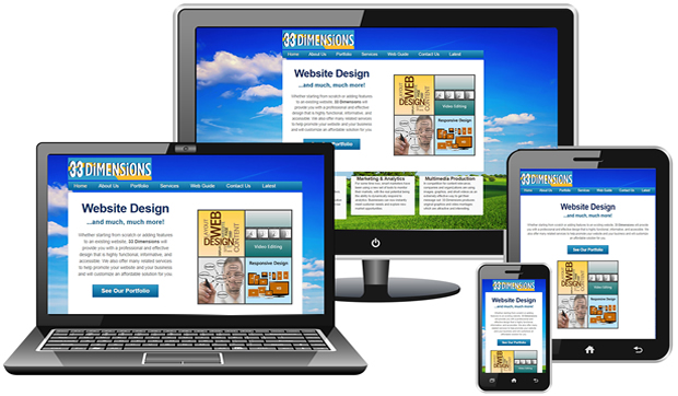
With the advent and proliferation of mobile and smartphone technology, internet content can be accessed anywhere. As a website owner, it is important to make sure you can reach all of your users and provide them with all the information in the most optimized fashion. One very potent tool to meet this goal is Responsive Design. Although still a very new technique (it was first proposed in 2010), responsive design has become widely accepted as an efficient way to optimize a single website over various media devices.
The Concept of Responsive Design
Yes the mobile web is exploding and yes it is the driving force behind responsive design, but when we think of responsive design we need to consider more than just mobile. With the introduction of retina displays and video game browsers, internet users are now viewing websites on larger screen resolutions and in many different contexts.
Try to take into account different user contexts when designing and developing responsive websites. You need to think about what device a user is using, where the user is located, and how long it takes your site to load on various devices.
Content and Context
Content is everything but context is everywhere and we have a set of tools at our disposal that will allow us to manipulate layouts, optimize text sizes, and increase performance for any context so remember to use them. Fixed width websites can be limiting on larger and smaller screen resolutions.
The bottom line is that our web sites should be accessible to everyone no matter what device or screen resolution they are using, without restrictions. Responsive design is a great tool for achieving this goal.